They say don’t judge a book by its cover... but we all do. And that’s a good thing! A great cover isn't just a pretty picture; it’s a promise to the reader. It tells you exactly what kind of ride you're about to get on.
Recently, I looked at the original cover for Behind The Stars and I realised something: it wasn't keeping its promise. While my other works embrace the heartfelt and the emotional (the 'Queen of Tears' brand is real, folks!), this particular story has a much darker, sharper edge.
It was time for a change. Because sometimes, a change is good. And this story deserved a cover that looked as thrilling as it felt to write.
Why the original wasn't working
The original Behind The Stars cover was lovely. It had a certain mystery to it, with the detailed eye and the star pupil. But for a psychological thriller, it felt a little too... serene. It whispered when it should have shouted, "Watch your back!" It was attracting readers who wanted a soft mystery, and then hitting them with some very dark, tense plot points. I knew I needed to pivot.
The Transformation
If you want to catch a thriller reader’s eye, you have to speak their language.
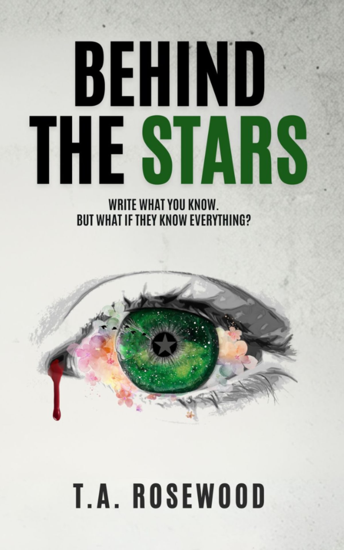
Thriller covers are about tension, contrast, and high stakes. So, the first thing to go was the flat background. I wanted something that felt more textured and urgent.
We kept the central eye, the 'Behind The Stars' motif is crucial, but it needed a complete overhaul. We sharpened the details, deepened the colours (the green pupil and the star inside are more defined), and leaned into that central star-mask effect.
But the biggest change? The text. The font is what truly elevates it. We moved from the fancy script text to this new, bold style for the title and author name. The heavy, dark lettering immediately signals to the reader, "This is not a cosy mystery." It adds a layer of sophistication and grit that the previous version lacked. It feels definitive and serious.
My Author Pivot: Empathy to Dread
This wasn't just a visual revamp; it was an acknowledgment of my writing journey. I love exploring complex emotions and characters (the 'tears' aren't going anywhere!). But Behind The Stars showed me I also love exploring the dark side of that emotional depth. It's about paranoia, trust, and secrets. It’s about people who are so complex, you can’t tell if they are the hero or the villain.
I want my existing readers to trust that the emotional depth is still there. But I also want new thriller readers to see this cover and know they are getting a dark, psychological story.
So yes, the change is good. It's a sign of growth and a commitment to reaching the right readers. I’m now officially the 'Queen of Tears & Thrills' (patent pending!), and I can’t wait for you all to see what’s Behind The Stars.
What do you think of the new look? Are you ready for the thrill?